
Did you know that good ecommerce UI/UX design can boost conversion rates by up to 200%? The Indian e-commerce market has shown remarkable growth. The COVID-19 pandemic has pushed consumer behavior toward online shopping.
Our experience shows how ecommerce website UI design can affect business success substantially. The average ecommerce conversion rates stay around 3%. Your numbers can improve drastically when you use proper ecommerce conversion optimization techniques. This becomes crucial because 69.99% of online shopping carts are abandoned when checkout processes get complex. Mobile devices generated 73% of all ecommerce traffic and 63% of orders in 2022. These numbers show why mobile-first ecommerce UI UX design has become essential for businesses in the Indian market.
We’ll explore proven UI design patterns from Indian market leaders that deliver results in this piece. You’ll learn practical ways to create the best ecommerce UI design for your audience through simplified navigation and localized design elements.
UI Design Patterns That Drive Conversions in Indian E-commerce
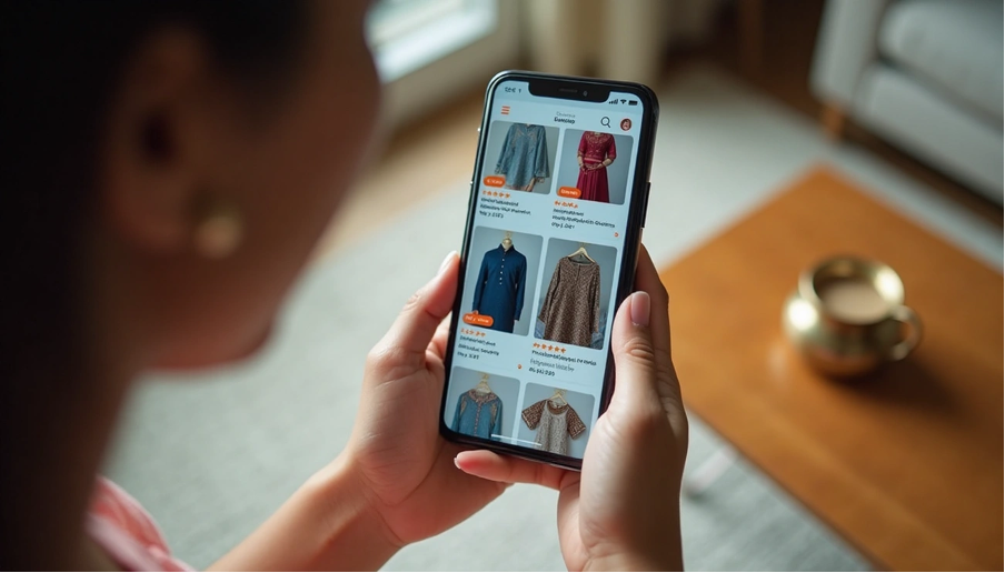
The way an ecommerce platform guides users through their buying experience determines its success. Studies show that smart UI design elements can speed up navigation by 22%, then shortening the path to purchase.
Simplified Navigation with Sticky Menus
Sticky navigation menus stay visible as users scroll, giving them a consistent reference point throughout their shopping. This feature is a great way to get value for Indian ecommerce sites with large product catalogs. Unlike fixed navigation that disappears during scrolling, sticky menus act like travel companions that help users navigate and boost the overall experience. Sticky headers work exceptionally well for practical websites where visitors need to stay oriented to take immediate action.
Visual Hierarchy in Product Listings
Smart visual hierarchy guides user attention to key elements and makes shopping easier. Eye-tracking studies show that website top-left and top-center sections get the most attention during first impressions, which happen in less than a second. Here’s how to create compelling product listings:
- Use contrasting colors for important elements like CTAs and product titles
- Add proper spacing around critical elements
- Structure content according to F-pattern (for text-heavy pages) or Z-pattern (for landing pages)
- Use size variations strategically without overwhelming the layout
Trust Signals: Badges, Reviews, and Ratings
Trust signals have become crucial in the Indian market where cyber crime grew substantially during the pandemic. Research shows 92% of consumers express concerns about sharing personal information on unfamiliar websites. Security badges, customer reviews, and ratings help shoppers trust your legitimacy. Star ratings work best near the top of product pages with links to full reviews in lower sections. Clear return policies and visible contact information remove perceived purchase risks.
Persistent CTAs on Mobile Screens
73% of ecommerce traffic comes from mobile devices, making persistent call-to-action buttons vital for conversion. You need to decide which CTAs deserve permanent screen presence. Mobile sites need more action buttons throughout the page because users shouldn’t have to scroll to find the main action. Place “dripping pan” CTAs at the bottom of pages to catch fast scrollers who reach the end.
Love these proven design strategies? Our team at The ASK Network helps e-commerce brands bring them to life. Let’s create an experience your customers will love. Work With Our UI/UX Experts
Localization Patterns for Indian User Behavior
The Indian ecommerce market faces unique UI design challenges due to its language diversity. With 22 official languages and regional language users growing at a CAGR of 32%, online retailers must localize their platforms to succeed in India.
Use of Regional Languages in UI Labels
English proficiency and internet usage in India show a huge gap. Only 20%-30% of India’s population speaks English well, despite its massive online presence. This gap creates a great business chance as 45% of Indian shoppers want to buy products in their regional language. Research shows 75% of consumers like websites that show information in their native language.
Big platforms have adapted to this reality. Amazon has added thousands of product descriptions in Indian languages and created videos for non-readers. JioMart lets customers shop in seven different Indian languages, which helps them reach more customers.
Color Psychology Adapted to Indian Priorities
Colors shape how users perceive and act in the Indian market. Here’s what different colors mean:
- Red: Symbolizes beauty, wealth, and power
- Green: Represents harvest, fertility, hope, and virtue
- Orange: Conveys wisdom, sacredness, and love
- Yellow: Associated with sacredness and luck
Smart use of these culturally-meaningful colors in ecommerce UI design helps build stronger bonds with Indian consumers.
Cash on Delivery and Local Payment Gateway Integration
Cash on Delivery (COD) remains India’s most popular payment method because many people don’t trust online payments. COD helps businesses:
- Cut down cart abandonment from payment failures
- Build trust with customers who hesitate to pay online
- Reach customers who can’t access online payment methods
Businesses should customize COD rules based on location, order value, and product types. Amazon has shown this works well – they take cash payments and have warehouses near rural areas to support this payment method. Good localization helps boost engagement and customer loyalty. Users stay loyal when websites match their cultural expectations.
Mobile-First UI Design Patterns for Indian Shoppers
650 million smartphone users make mobile-first design crucial for ecommerce success in India. Leading Indian ecommerce platforms optimize their UI based on how people use their devices.
Bottom Navigation Bar for Thumb Reach
Studies reveal that 49% of people hold smartphones with one hand and 75% of interactions happen through thumbs. Indian ecommerce apps have adopted bottom navigation bars that put important functions where thumbs can reach easily.
Bottom navigation works because it respects our physical limits. The natural zone of thumb movement should guide the placement of key elements. To name just one example, Swiggy’s bottom tab navigation lets users move between main sections without finger strain.
Users benefit from better usability, deeper involvement, and an accessible interface that works for different hand sizes. The bottom navigation should stick to 3-5 key destinations that users need throughout the app. Ecommerce platforms usually put home, search, categories, cart, and account here.
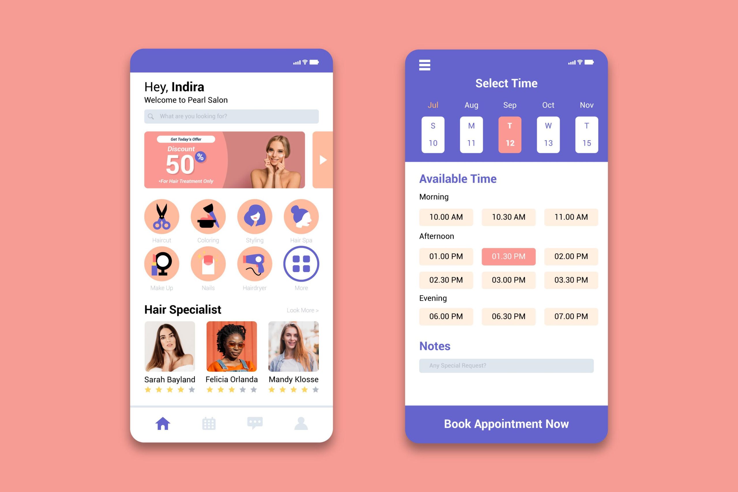
One-Tap Checkout for Returning Users
One-tap checkout makes buying simple by saving customers from typing their details repeatedly. This matters even more on mobile devices where typing feels awkward.
The feature solves a real need since 81% of Indian shoppers use smartphones for purchases. A good implementation has:
- Mobile interfaces that load quickly
- Messages that confirm actions clearly
- Buttons placed where thumbs can tap easily
- Options to reorder fast
This simplified checkout cuts cart abandonment and boosts sales.
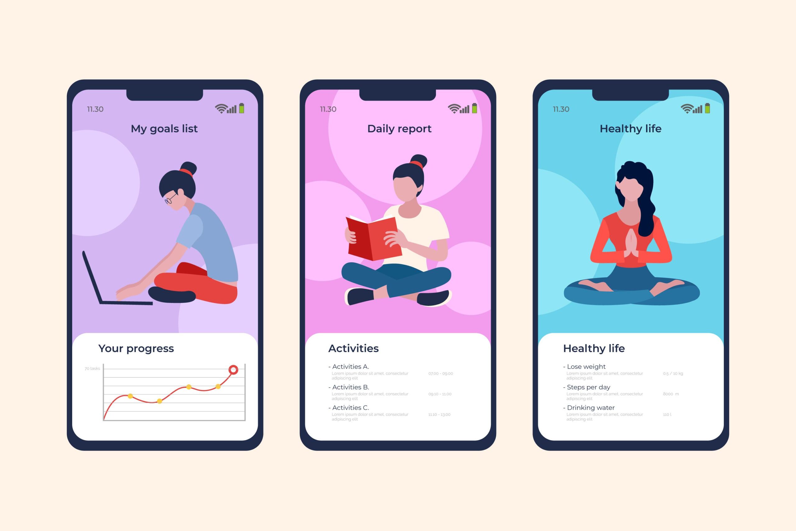
Progressive Disclosure in Product Details
Progressive disclosure shows information step by step, from basic to detailed, which helps reduce confusion on small screens. The approach starts with core product details and reveals more when asked.
Ecommerce product pages using this pattern have:
- Product images and price front and center
- Specifications hidden in expandable sections
- Technical details lower down or behind tabs
Mobile shoppers can make quick decisions without feeling overwhelmed by information. The clean interface helps users focus on buying instead of sorting through too many details.
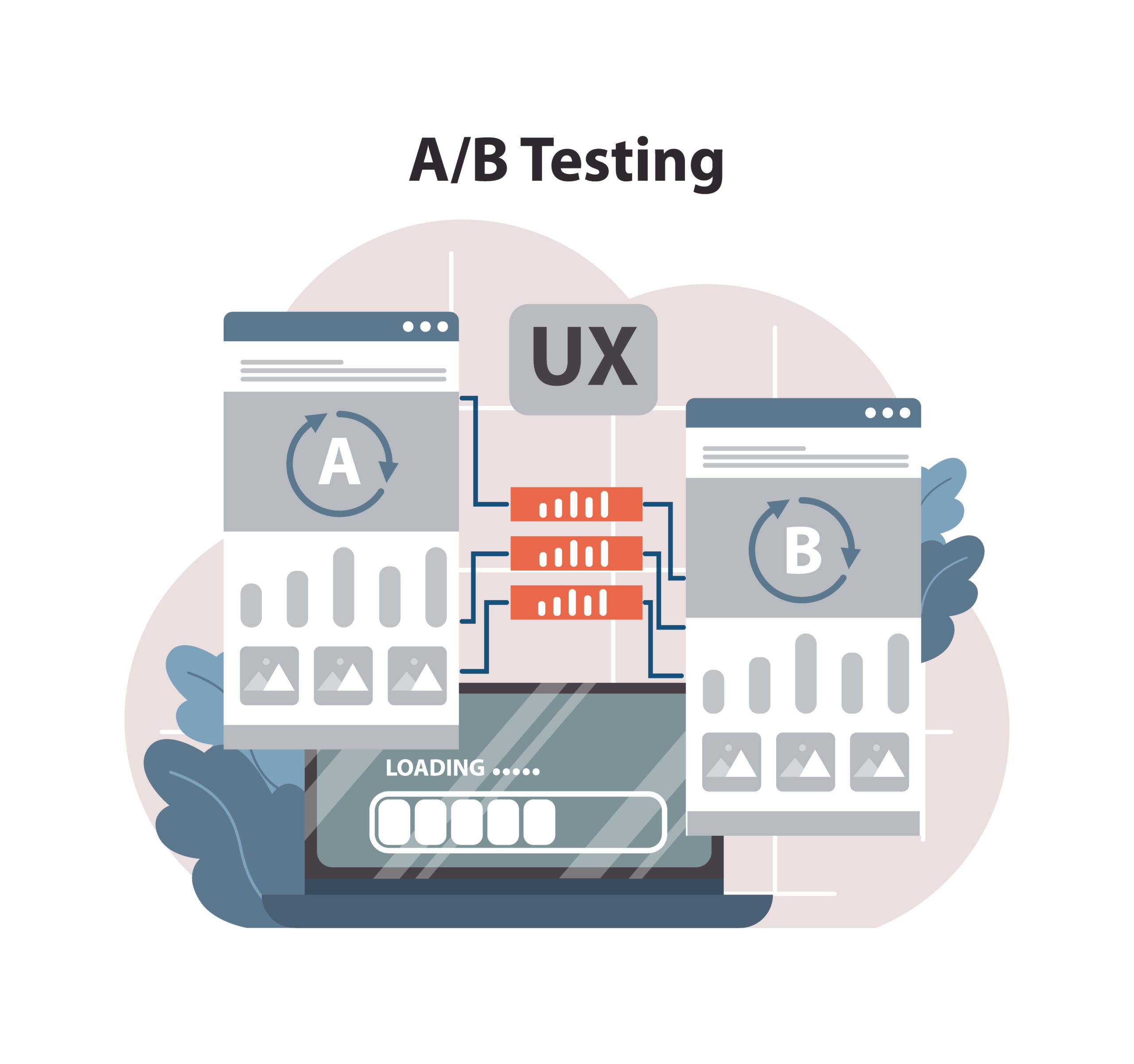
Tracking What Works: UI Performance and A/B Testing
Evidence beats intuition when you create exceptional ecommerce UI design. Success in the competitive Indian market depends on your ability to track and test how users interact with your interface.
Heatmaps and Scroll Maps for Behavior Analysis
Heatmaps show complex user behavior through visual insights. They help you find which elements grab attention and which ones users ignore. These colorful visualizations use red to show high-engagement areas and blue for less-engaged sections. Scroll maps show how far users scroll down your page and display the exact percentage of people who view each section.
These tools are a great way to get several benefits:
- You can spot false bottoms where users think content ends
- Your critical CTAs can be placed within the average fold
- You’ll know if users find your navigation easy-to-use
Indian ecommerce platforms use heatmap analysis to see if regional language elements get enough attention and payment options remain visible.
A/B Testing CTA Placement on Product Pages
A/B testing lets you compare two webpage versions to see which one works better. This technique removes guesswork from design decisions when you apply it to CTA placement on product pages.
Your conversion rates can change dramatically by testing CTA button placement, size, and color. To cite an instance, see if displaying customer reviews directly on product cards boosts add-to-cart rates compared to showing reviews only on product detail pages. Yes, it is common for ecommerce sites to find that moving CTAs below the fold can boost conversions by up to 304% in certain contexts.
Also Read: How to Design Inclusive UX That Actually Works in the Indian Market
Conversion Funnel Drop-off Tracking
Your UI friction points become clear when you identify where users abandon the conversion process. The quickest way to track funnel performance:
- Map out main conversion paths using analytics tools
- Define events for each stage from entry to purchase
- Calculate drop-off rates between stages to spot critical issues
GA4’s key events like begin_checkout, add_shipping_info, add_payment_info, and purchase help you understand the complete checkout experience. You can then analyze drop-offs to make targeted improvements. Regular testing and optimization create a cycle of improvement. This process turns data into applicable design decisions that boost your ecommerce UI design’s effectiveness.
Conclusion
E-commerce UI design for the Indian market needs informed decisions and a strategic approach. This piece explored design patterns that greatly affect conversion rates and customer satisfaction. Sticky menus, thoughtful visual hierarchy, and prominent trust signals create smooth shopping experiences. Regional language implementation and culturally relevant color choices help brands connect with India’s diverse population.
Mobile optimization emerges as the most crucial element since 73% of all e-commerce traffic comes from smartphones. Indian consumers benefit from bottom navigation bars, one-tap checkout, and progressive disclosure patterns that match their device usage. Our team at The ASK Network can help bring these proven design strategies to life. Your customers will love their new experience. Work With Our UI/UX Experts.
Successful e-commerce UI design thrives on constant testing and refinement. Heatmaps show real user behavior while A/B testing confirms design decisions. Conversion funnel analysis identifies areas where improvements will yield the best results. These design patterns combined with thorough testing build strong foundations for e-commerce success in India’s fast-moving digital world.
The gap between average and exceptional e-commerce experiences comes down to smart UI design choices. Brands can build interfaces that boost conversions and foster lasting customer relationships by applying proven patterns that cater to Indian shoppers’ unique needs. In the end, successful e-commerce UI design combines cultural awareness with technical excellence to turn browsers into buyers through interfaces that feel natural and smooth.
FAQs
Q1. What are some effective UI design patterns for Indian e-commerce websites? Some effective UI design patterns include simplified navigation with sticky menus, visual hierarchy in product listings, trust signals like badges and reviews, and persistent CTAs on mobile screens. These patterns help improve user experience and drive conversions.
Q2. How important is mobile optimization for e-commerce in India? Mobile optimization is crucial for e-commerce success in India. With 73% of all e-commerce traffic coming from mobile devices, features like bottom navigation bars, one-tap checkout, and progressive disclosure of product details are essential for catering to mobile shoppers.
Q3. Why is localization important for e-commerce UI design in India? Localization is vital due to India’s linguistic diversity. With 22 official languages and a growing regional language user base, incorporating regional languages in UI labels and adapting color psychology to Indian preferences can significantly improve user engagement and conversions.
Q4. What role does Cash on Delivery (COD) play in Indian e-commerce? Cash on Delivery remains a predominant payment method in India due to widespread mistrust of online payment systems. Implementing COD can reduce cart abandonment, build trust with customers hesitant about digital transactions, and expand customer reach to those without access to online payment methods.
Q5. How can e-commerce businesses track and improve their UI performance? E-commerce businesses can track and improve UI performance through methods like heatmaps and scroll maps for behavior analysis, A/B testing CTA placement on product pages, and conversion funnel drop-off tracking. These techniques provide valuable insights into user behavior and help identify areas for improvement.