
Missed appointments cost independent practices up to ₹30Lacs annually. Each no-show drains ₹4000 or more in lost revenue. Healthcare UI/UX design offers a proven solution. AI-powered reminders and easy-to-use interfaces can lower no-shows by up to 30%. Your clinic’s digital presence isn’t just about aesthetics. It’s about creating a continuous patient acquisition funnel that converts visitors into booked appointments. This piece is about why most clinic websites fail to secure bookings, how strategic healthcare UI UX design directly affects your medical website conversion rate, and the self-check tool features that can reshape your custom clinic website into a booking powerhouse.
Why Most Clinic Websites Struggle With Patient Bookings
Your clinic website receives hundreds of visitors each month, yet only a fraction book appointments. The gap between traffic and conversions stems from four critical healthcare UI/UX design failures that systematically push potential patients toward competitors.

Poor Navigation Breaks the Patient Acquisition Funnel
Cluttered menus and complex navigation structures create friction in the patient acquisition funnel right away. Patients visit clinic websites to book appointments, check services, or consult doctors. They expect straightforward pathways. Overloaded menus with multiple dropdowns and submenus irritate users and increase bounce rates, especially when technical jargon replaces patient-friendly labels.
Research shows that 61% of users will move to another site quickly if they don’t find what they’re looking for right away on a mobile platform. This behaviour pattern reveals how poor navigation affects your medical website conversion rate directly. Patients seeking urgent healthcare information won’t guide themselves through three layers of menus to find a booking form. Disconnected user experiences make moving from the homepage to services or contact information feel laborious and lead to drop-offs right away.
Confusing Appointment Forms Drive Visitors Away
Traditional appointment booking systems create unnecessary barriers between interested visitors and confirmed bookings. Manual coordination through phone calls forces patients to wait on hold, call during limited office hours, or make multiple attempts just to secure an appointment slot. This outdated approach delays access to healthcare and discourages timely care for non-urgent consultations.
The complexity extends to online forms as well. Complex booking forms increase perceived wait times and cause patients to abandon the process midway. Forms that demand excessive information upfront rather than capturing essential details first make patients lose patience. The lack of live availability creates confusion and repeated follow-ups. Manual appointment scheduling increases the risk of double bookings that frustrate both patients and staff.
Mobile-Unfriendly Designs Cost You Half Your Patients
Mobile devices dominate healthcare searches, with 70% of web traffic originating from mobile phones. 80% of internet users access websites via smartphones, making mobile responsiveness non-negotiable for custom clinic websites. 85% of adults think a mobile-friendly website is a fundamental requirement for healthcare providers.
Your clinic website that fails mobile optimisation tests makes text difficult to read without zooming, buttons hard to tap, and navigation confusing. This frustrating experience doesn’t just inconvenience patients but damages trust. Studies confirm that 83% of mobile users anticipate an excellent experience on websites, whatever device they use. Failing to meet these expectations results in a 40% shift to a competitor’s platform and cuts your potential patient base in half directly.
Slow Loading Times Create Instant Abandonment
Page speed functions as the gateway to every other element of your healthcare UI UX design. Nearly 53% of users leave a page if it takes more than 3 seconds to load on mobile devices. The average website user spends less than 15 seconds on a site. Slow loading times eliminate any chance of converting visitors into booked appointments.
Speed issues harm appointment booking pages, particularly where patients seek quick answers and action right away. Oversized images, excessive HTTP requests, unoptimised scripts, and slow server responses create bottlenecks. Your booking page that lags makes even interested patients abandon the process before completing their appointment request. This results in lost revenue and wasted marketing spend.
How Healthcare UI UX Design Directly Impacts Booking Rates
Patient booking decisions operate at the intersection of emotion, trust, and perception. Healthcare UI/UX design taps into these psychological drivers to remove friction from the patient acquisition funnel and increase your medical website conversion rate.
The Psychology Behind Patient Booking Decisions
Patient choice rarely centres on price or location alone. Behind every appointment booked sits a complex mix of trust, emotional connection, and perceived competence. Patients feel confident in your practise’s expertise and transparency. They arrive prepared and ask fewer clarifying questions. This reduces staff time spent on repeated explanations and minimises scheduling disruptions.
The first interaction a patient has with your custom clinic website sets expectations for every subsequent touchpoint. A welcoming, organised interface creates comfort and decreases appointment cancellations. It accelerates the check-in process. Patients who feel understood right away require less intervention from staff. This frees up time for care delivery. Research confirms that 60% of patients would choose one healthcare provider over another based on strong online presence and website quality. Your website functions as the digital extension of your clinic’s standards. A disorganised layout or mismatched colour scheme suggests the same issues might extend to patient care.
Visual Hierarchy Guides Patients to Book Faster
Visual hierarchy utilises Gestalt theory, where the human brain groups information as a whole to process it. The Von Restorff effect shows that items standing out visually demand attention. This principle guides user actions and focuses attention on booking elements. Designers use size, colour, contrast and white space to communicate information hierarchy. Larger elements draw more attention, whilst smaller ones support the overall layout. Call-to-action buttons like “Book an Appointment” need increased visual weight through larger fonts or bolder styles. This ensures they stand out.
Complete reviews on usability assessments determined that fewer than 50% of health-related websites presented a clear visual hierarchy. Patients struggle to focus without a well-defined hierarchy. This leads to cognitive strain and abandoned bookings.
Trust Signals That Convert Website Visitors
Potential patients land on your site and decide within seconds whether to book an appointment. Clear, high-quality photos and brief bios humanise you. Mention your speciality and years of experience to set realistic expectations. Short testimonials feel authentic when placed near your booking button. They should mention outcomes, wait times or staff behaviour. Degrees, certifications and professional memberships establish authority without overwhelming readers. A prominent appointment button followed by a step-by-step booking flow reduces abandonment. Transparency in fees, consultation length and required documents reduces hesitation.
Reducing Cognitive Load in Medical Website Design
Working memory handles only five to nine elements of information at any given time. It retains them for approximately 20 seconds without prompting. Patients abandon tasks when cognitive load exceeds available memory resources. More than 67% of site visitors abandon a form for good if they encounter an issue with it. Healthcare interactions often occur under stressful conditions. Patients seek clarity while they grapple with symptoms and care decisions. Key tasks like appointment scheduling should be simplified into easy steps. This reduces mental strain. Pre-populated details using stored patient data minimise repetitive form filling. Immediate availability eliminates back-and-forth communication. This saves time and reduces input errors.
The Self-Check Tool Secret: What Makes It Triple Bookings
Self-check tools represent the missing link between healthcare UI/UX design and booking conversion rates. These digital solutions extend beyond aesthetic improvements to reshape how patients interact with your custom clinic website.
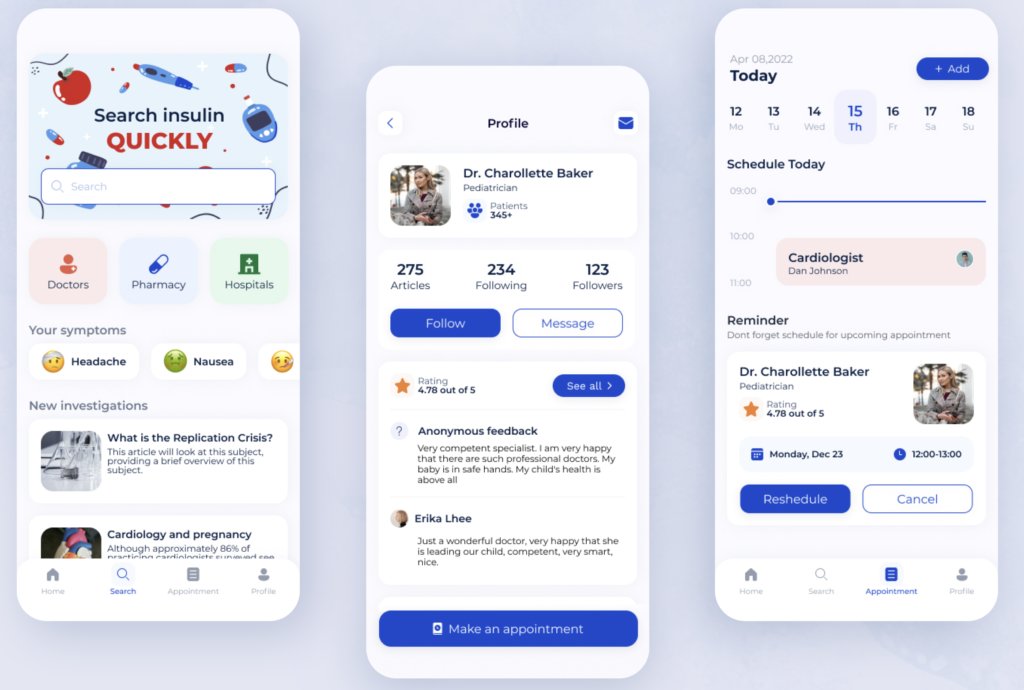
What Self-Check-In Tools Actually Do
Automated software or digital touch panels power self-service check-in and function as alternatives to conventional front desk service. Patients select their reservation, verify identity through scanned documents, process payments, and receive confirmation within minutes. The system syncs with your property management system instantly to update appointment status and streamline operations. Patients complete registration, verify insurance details, and submit required forms without staff intervention, whether they use kiosks in your lobby or mobile devices from their cars.
Why Patients Prefer Self-Service Booking Options
Convenience and control drive patient demand for self-service options. Research confirms that 61% of consumers rate online appointment scheduling as very important when choosing a new provider. 97% of patients expect online scheduling capabilities from their healthcare providers. The preference extends to related tasks. 77% show strong interest in completing pre-visit questionnaires online, and 69% want to make payments digitally. More than 30% of self-scheduled appointments occur between 6 p.m. and 8 a.m., which demonstrates how patients book outside traditional office hours.
How Self-Check Tools Reduce Front Desk Bottlenecks
Automated check-in eliminates queues at reception desks whatever the staff’s availability. Kiosks reduce the administrative burden on front office staff by allowing patients to input their own information. This frees them to focus on complex patient needs rather than repetitive data entry. One study reported a 14-minute reduction in time to identification through self-check-in. Practices implementing immediate scheduling report a 67% reduction in booking-related service calls. Your team can concentrate on care delivery while patients manage routine administrative tasks independently.
Immediate Availability Display Changes Everything
Appointment slots update within seconds across all platforms with immediate availability. Someone books a time slot, and it disappears from websites, mobile apps, and staff systems right away. This synchronisation prevents double bookings and reduces scheduling conflicts. Practises using immediate scheduling see a 23% increase in online booking completion and a 41% reduction in no-shows. The transparency eliminates back-and-forth communication and saves time while reducing errors for both patients and staff.
Pre-Visit Forms That Patients Actually Complete
Digital pre-visit forms achieve remarkable completion rates when designed right. Studies show 67% of patients complete forms before appointments remotely. The preference for digital forms is overwhelming. 92% of patients favour online completion rather than phone or in-person methods. High completion rates occur because patients submit information at their convenience, which eliminates redundant data entry and reduces in-office wait times. Women demonstrate higher completion rates than men at 71% versus 64%.
Integration With Your Existing Clinic Systems
Self-check tools connect with your existing practice management systems and electronic health records. This ensures immediate updates on appointment availability, patient data, and payments. This integration maintains accurate information while minimising errors from manual entry. The continuous data flow between self-check interfaces and your backend systems eliminates duplicate work and ensures consistent patient information across platforms.
Stop losing patients to friction. Let us build a custom Suitability Self-Check Tool for your practise. Book a UI/UX mapping session with our lead developers today.
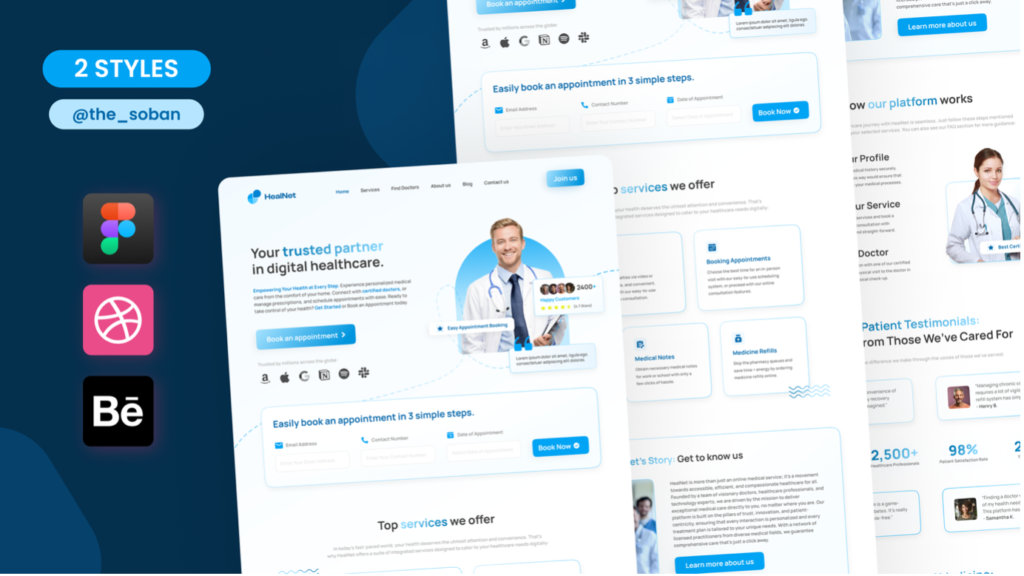
Essential UI UX Elements for High-Converting Custom Clinic Websites
Converting clinic visitors into booked patients requires specific healthcare UI/UX design elements working together across your custom clinic website. Each component addresses a distinct friction point in the patient acquisition funnel.
Clear Call-to-Action Button Placement
Your primary call-to-action belongs above the fold, visible without scrolling. This ensures visibility the moment a page loads. Positioning booking buttons at the end of service pages, blog posts and contact sections provides multiple conversion opportunities. Sticky headers or floating buttons that remain visible during scrolling work especially well for mobile visitors. Action-oriented phrases like “Book Your Appointment Now” outperform vague alternatives. Contrasting colours and distinct shapes draw attention, and tying CTAs to specific value propositions boosts appeal.
Simple Booking Flow Design
Successful clinics implement multiple booking methods without complicated multi-step processes. Patients complete bookings within two to three clicks. This reduces frustration and cuts down the time spent. Keep forms concise and capture only what’s needed upfront. Confirmation and follow-up communication close the loop.
Transparent Pricing and Service Information
Displaying consultation fees or general pricing ranges builds trust right away and reduces patient anxiety. Transparency helps patients feel more in control when they understand financial expectations. Service pages should explain treatments in plain language and outline what to expect and who benefits.
Patient Portal Access Points
Patient portals require mobile-friendly interfaces with clear navigation systems. Simple sign-up processes that allow email IDs rather than creating new usernames increase adoption. Portals should offer appointment scheduling, secure messaging and access to health records. Notification features engage patients without requiring portal login.
Measuring Your Medical Website Conversion Rate Improvements
Tracking performance confirms whether your healthcare UI/UX design improvements actually increase bookings. Measurement transforms assumptions into useful data that refines your patient acquisition funnel.
Key Metrics to Track Before and After
Conversion rate separates successful custom clinic websites from unsuccessful ones and measures users who complete desired actions relative to total visitors. Web analytics track direct user interactions, including visitor numbers, time spent on site, and click paths. Acquisition metrics reveal traffic sources, whether direct, referral, organic search, or social media. Pages per session indicate engagement depth. Time on site reflects how well your website holds attention. Bounce rate reveals single-session users who leave without further interaction and often signals usability issues.
A/B Testing Your Booking Interface
Split testing compares two navigation or form versions to determine which achieves better conversions. Medical websites benefit from testing headlines, imagery, and calls to action to identify what appeals to patients. This analytical approach minimises risk and invests resources in changes that improve outcomes.
Patient Feedback on User Experience
Optimal feedback collection occurs 24 to 48 hours after visits when experiences remain fresh, yet patients have time to reflect. Digital platforms allow patients to provide detailed accounts at their own pace. Anonymous channels encourage candid responses about sensitive issues.
Conversion Funnel Analysis Tools
Google Analytics tracks user behaviour through custom funnels and shows where conversions happen and drop-offs occur. Heatmap tools reveal click patterns and scroll depth, and pinpoint UX issues causing friction. Session recordings capture individual user journeys and expose navigation problems.
Key Takeaways
Healthcare UI/UX design transforms clinic websites from digital brochures into powerful booking engines that can dramatically increase patient conversions and reduce operational bottlenecks.
- Poor navigation and slow loading times cause 53% of patients to abandon clinic websites within 3 seconds, directly costing practises potential bookings.
- Self-check tools triple booking rates by offering 24/7 scheduling convenience, with 97% of patients expecting online booking capabilities from healthcare providers.
- Mobile-optimised designs are essential as 70% of healthcare searches occur on mobile devices, and mobile-unfriendly sites lose half their potential patients to competitors.
- Real-time availability displays reduce booking-related service calls by 67% whilst increasing online booking completion rates by 23%.
- Strategic visual hierarchy and clear call-to-action placement guide patients through simplified booking flows, reducing cognitive load and form abandonment rates.
The secret lies in understanding that patients make booking decisions within seconds based on trust, convenience, and perceived competence. When your website removes friction through intuitive design and self-service options, you’re not just improving user experience—you’re directly increasing revenue and operational efficiency.
Conclusion
Your clinic’s digital interface functions as the first point of care and shapes patient perceptions before they ever walk through your doors. Healthcare UI/UX design isn’t about visual appeal but about removing friction from every step of the patient acquisition funnel. Self-check tools stand out as the most effective conversion driver. They offer patients the convenience they just need and free your staff for meaningful interactions.
Stop losing patients to friction. Let us build a custom Suitability Self-Check Tool for your practise. Book a UI/UX mapping session with our lead developers today. The right design choices today translate into filled appointment slots tomorrow.
FAQs
Q1. What does healthcare UX design involve? Healthcare UX design focuses on creating user-friendly experiences for medical products and services, including electronic health records, appointment booking systems, and patient management apps. It ensures that patients can easily navigate clinic websites, complete forms, and book appointments without confusion or frustration.
Q2. How does the Pareto Principle apply to clinic website design? The Pareto Principle, or 80/20 rule, suggests that 20% of design decisions create 80% of the impact on your clinic website’s performance. By focusing on critical elements like clear call-to-action buttons, simplified booking flows, and mobile responsiveness, you can achieve the greatest improvements in patient bookings and conversion rates.
Q3. What are the key principles for effective healthcare website design? The four key principles—Consistency, Continuity, Context, and Complementary design—guide optimal user experiences. Consistency ensures uniform design elements across pages, continuity maintains smooth user journeys, context provides relevant information at the right time, and complementary features work together to support patient booking decisions.
Q4. Why do self-check tools increase clinic bookings? Self-check tools allow patients to book appointments, complete forms, and verify information at their convenience, often outside traditional office hours. They eliminate front desk bottlenecks, display real-time availability to prevent double bookings, and reduce administrative burden on staff, resulting in higher completion rates and fewer no-shows.
Q5. What metrics should clinics track to measure website improvements? Essential metrics include conversion rate (percentage of visitors who book appointments), bounce rate (visitors who leave immediately), pages per session, time spent on site, and traffic sources. Additionally, tracking form completion rates, appointment booking times, and patient feedback helps identify areas for improvement in your website’s user experience.