

Mobile UI design practices in India shape how over a billion people use digital services every day. The Covid-19 pandemic led users to spend substantially more time on their smartphones. Apps have become the quickest way to convert users, who now prefer them over websites for most mobile activities.
Popular Indian apps like ETMoney, Swiggy, and Unacademy show us what works. These apps have won millions of users through smart mobile design patterns that solve unique Indian challenges. Language support and localised content are the foundations of any mobile design system, especially with India’s 22 official languages. Indian users strike a chord with customised experiences. They tend to stay longer and interact more with apps that feel personal. This piece heads over to the hidden patterns that power billion-user apps and shows how they’ve become skilled at creating designs that connect with India’s diverse population.
Personalisation Patterns in Indian Mobile UI
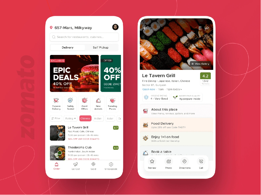
Image Source: UserExperior
“If we want users to like our software, we should design it to behave like a likable person: respectful, generous and helpful.” — Alan Cooper, Software Designer and Programming Pioneer
Personalisation stands out as one of the most powerful mobile design patterns in India’s app ecosystem. Apps that tailor experiences to each user’s priorities show higher engagement and conversion rates as India’s smartphone user base grows. Let’s get into how three successful Indian apps use personalisation to create compelling user experiences.
Urban Ladder’s User Behavior-Based Recommendations
Urban Ladder, India’s leading e-retailer of furniture and décor, shows how behavior-based recommendations can boost conversion metrics. The company used Blueshift’s Segment-of-1 Marketing platform to deliver individual-specific experiences based on up-to-the-minute data analysis. This move paid off well – targeted personalised campaigns achieved 4x higher conversion rates compared to their previous tactics.
The furniture retailer uses several personalisation techniques in their mobile design system:
- Cross-channel triggered campaigns with welcome messages and abandonment reminders
- Product alerts such as back-in-stock notifications and price-drop alerts
- “Complete the Look” cross-sells that showcase complementary items
- Behavior-based product recommendations showing trending, top-converting, and top-selling items
Urban Ladder’s recommendation engine looks at multiple data points like browse history, buyer behavior, collaborative filtering, price points, city location, and product trends. This approach will give recommendations that stay relevant despite furniture e-commerce’s complexity.
ETMoney’s Tax Planner Personalisation
ETMoney shows how personalisation can make complex financial processes simpler through its mobile UI design. The app has over 5 million downloads and offers a clean, accessible interface that displays mutual funds by category with a personalised tax planner.
ETMoney added an innovative feature that creates instant capital gains statements during tax filing season. This personalisation solves the biggest problem – the app calculates taxable gains from mutual fund investments automatically. Users no longer face the “cumbersome” task of collecting data from multiple sources and making complex calculations.
The personalisation goes beyond convenience. It handles specific tax complexities from government changes, like the 10% long-term capital gains tax on equity investments over ₹1 lakh yearly. Users can choose auto-updates where statements generate automatically during tax season each year. This creates an experience that adapts to recurring needs.
Swiggy’s Recently Ordered Carousel
Swiggy, a household name in India’s food delivery market, uses personalisation to make reordering easier with its recently ordered carousel. The app’s clean interface uses carousel cards that highlight previously ordered items, making the reordering process accessible.
Swiggy has developed a sophisticated Widget Ranking (WiRa) framework that customises the entire homepage layout for each user. The app uses dynamic slots with candidate widgets ranked by individual user priorities instead of static layouts. A/B experiments in four cities tested this personalisation system. The results showed a clear improvement of 0.16 percentage points in dynamic slots’ order share.
The pan-India experiment delivered even better results – a gain of 1.08 percentage points in dynamic slots’ order share. The system ranked six widgets: Popular Curations, Popular Brands, Coupons For You, Try Something New, In The Spotlight, and Banner Carousel.
These three examples show how smart personalisation in mobile UI design creates more engaging and successful apps in the Indian market. These best UI apps have won millions of loyal customers in a competitive digital world by tailoring experiences to individual users.
Localised Design for India’s Diverse User Base
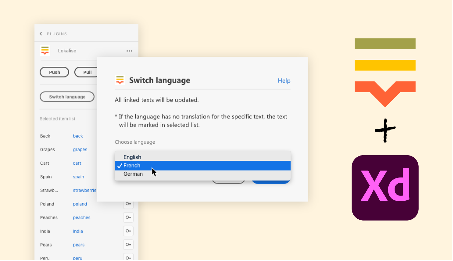
Image Source: Lokalise
Building apps for India requires designers to work with incredible diversity. The country has 22 official languages and hundreds of dialects. This makes localisation a basic requirement for mobile UI design strategies in India.
Language Toggle in Zomato and Swiggy
India’s food delivery giants Zomato and Swiggy have become skilled at making their apps available in multiple languages through naturally integrated language toggles. Zomato places a prominent language selector that lets users switch between Indian languages without app restarts or complex menu navigation. Users see this feature during onboarding and can find it in profile settings. They can switch their preferred language anytime.
Swiggy uses a different strategy with a constant language toggle that changes based on location data. The app suggests regional languages based on where users are while keeping Hindi and English as standard choices. More importantly, language settings work the same way across all devices, creating a smooth experience however users access the service.
Both apps show smart design patterns by making sure language selection doesn’t interrupt the user’s experience. Their approaches share key features:
- Settings stay the same after app updates
- Simple toggles that need few taps
- Complete translation of all UI elements
- Priority to regional languages based on location
These language features are core parts of their mobile design systems, not just add-ons. Text sizes adjust automatically for longer phrases in different languages while keeping the interface looking good.
Cultural Visuals in Dineout’s Restaurant Listings
Dineout does an excellent job adding cultural elements to its visual design. The restaurant discovery platform uses images that strike a chord with local tastes. The app uses several thoughtful design patterns: The platform changes its visual elements during major Indian festivals like Diwali, Holi, and Eid. Restaurant listings show festival-specific designs that celebrate these occasions without affecting how people use the app.
Dineout’s restaurant cards use region-specific visual hints to help users spot cuisine types quickly. North Indian restaurants show tandoor images, while South Indian ones display dosas or idlis. These visual clues help users find what they want faster. The app shows photos that match regional eating styles. Images from Northern India show family-style serving since shared plates are common there. Southern regions focus on thalis in their photos. These considered choices show how the best UI apps blend cultural awareness into their mobile designs.
Good localisation in Indian mobile design needs more than just translation. Successful apps know that true localisation must cover visual elements, cultural references, and regional priorities. As more people across India’s diverse regions use mobile devices, careful localisation becomes crucial for apps wanting wide adoption.
The difference between basic translation and detailed localisation often determines which apps succeed in India’s competitive digital market. The apps that treat India’s diversity as a chance to innovate rather than a problem are the ones that thrive.
Offline and Low-Bandwidth Design Patterns
Poor internet connections cost Indian businesses over ₹143.45 billion yearly. This reality has made offline functionality a must-have feature for successful Indian apps. Smart offline design patterns have become essential elements in mobile UI design strategies across India.
HabitHub’s Offline Habit Tracking
Indian app users need offline-first architecture, and HabitHub shows how it’s done right. The app uses a local database as its single source of truth for user data. Users can access all features without an internet connection. This design matches the best patterns for apps in areas with limited connectivity.
The app saves data locally with a “pending” flag when users add or change their habits. A sync process runs periodically to upload this information once internet becomes available. This smart design brings several benefits:
- Users never see frustrating loading indicators or empty views
- The experience stays consistent whether online or offline
- No data gets lost during connection drops
HabitHub builds trust with users by treating the local database as its main data source. The app runs smoothly even when users face frequent connectivity issues.
Preloaded Content in Unacademy’s Video Player
Unacademy stands among India’s top educational platforms. The platform has built advanced preloading features into its mobile design system. Students can “download lessons and learn anytime, anywhere”. This feature tackles a basic challenge for educational content delivery across India’s varied internet landscape.
The video player comes packed with smart design patterns:
- The app spots WiFi connections and uses them for big file downloads
- Downloads continue even when users switch to other apps
- Smart storage management keeps device space optimised
A splash screen hides the download process, keeping users engaged without highlighting connectivity issues. The platform saves users’ data costs by preferring WiFi for video downloads. The design acknowledges both internet reliability and cost as major hurdles in India. Users can choose between free and coin-based downloads, based on their subscription status and needs.
Successful Indian apps adapt to infrastructure limits through these offline and low-bandwidth patterns. They turn connectivity challenges into opportunities. Their thoughtful mobile UI designs ensure great user experience, no matter the connection status.
Minimalist UI for High Engagement
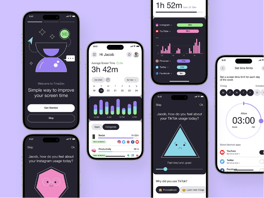
Image Source: Medium
Minimalist UI design has become the life-blood of successful Indian mobile applications. Microsoft research that indicates our attention spans have shortened to merely eight seconds shows why apps need simple designs to create better user experiences. We stripped away unnecessary elements and focused on core functionality. This helps users accomplish tasks quickly while reducing cognitive load.
ETMoney’s Clean Investment Dashboard
ETMoney showcases minimalist mobile UI design through its uncluttered dashboard. Users get a complete overview of investments, expenses, and savings. The app’s clean interface makes financial management available to its 5+ million users. Many competitors use feature-heavy interfaces, but ETMoney’s dashboard presents information hierarchically. It uses larger fonts for headers and maximises space without requiring excessive scrolling. The app’s design philosophy fits perfectly with modern mobile design patterns that avoid unnecessary clutter.
HabitHub’s Chain Visualisation Simplicity
HabitHub brilliantly applies Jerry Seinfeld’s “Don’t break the chain” productivity method. The app uses minimal design so users can quickly see their habit streaks through a clean calendar interface. The weekly overview gives instant progress assessment across multiple habits. Users can tap into any habit to see monthly performance through simple chain visualisation. The app also includes Android widgets that show habit performance without opening the app. This thoughtful mobile design system boosts user involvement through simplicity.
Zomato’s Label-Based Restaurant Filters
Zomato’s label-based filtering system shows how minimalism can improve complex search functionality. The app had multiple search bars across different sections that created a fragmented experience. Its redesigned interface introduced “Suggested Filters”—a contextual system that shows relevant options based on search context. To cite an instance, searching for “Cafes” suggests filters like “WiFi” and “Outdoor Seating.” Food delivery searches display “Express Delivery” options. These filters are tailored to each user by prioritising recent and frequent choices. This implementation proves that mobile UI designs in India can simplify complex functionality without losing utility.
These examples show how minimalist design patterns for mobile applications boost engagement through simplicity, visual clarity, and focused functionality.
Mobile-First Navigation and Interaction Models
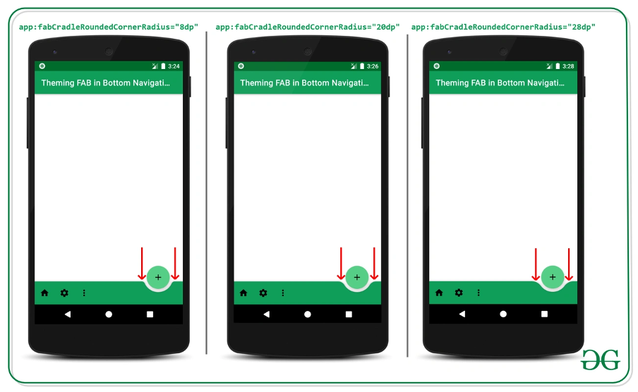
Image Source: GeeksforGeeks
“Design is about three dimensions and the five senses.” — Danielle Sacks, Design Journalist and Industry Expert
Mobile apps in India succeed when they get touch interactions right. Most Indian users connect to digital services through their smartphones, and the way they interact with apps determines how easily they can use them. This directly affects whether they keep using the app or uninstall it.
Floating Action Button in Dineout for Quick Booking
Dineout makes restaurant booking simple with a Floating Action Button (FAB). This circular button floats above the main content in the bottom right corner, making it easy for users to tap with their thumb. The FAB lets users book tables instantly – the main action people want to do on this restaurant discovery platform. This design pattern helps users make reservations in fewer steps and keeps the interface clean while focusing on what matters most.
Bottom Tab Navigation in Swiggy
Swiggy’s bottom tab navigation shows how well they understand the way people hold their phones. The food delivery app puts all navigation tabs at the bottom of the screen where thumbs can reach them easily. Users can switch between main sections without stretching their fingers. The app had some issues at first – swipe gestures would break the navigation bars. The team built their own system that works both as a regular navigation bar and a custom view, which made the experience smooth across the app.
Pinch-to-Zoom in Urban Ladder Product Pages
Urban Ladder makes furniture shopping better with pinch-to-zoom on their product pages. Users can look at furniture details up close without jumping to different screens. Their app documentation states that users can “appreciate intricate design details with a simple pinch-and-zoom gesture” while they browse products. This feature is perfect for furniture shopping because people need to see materials, textures, and craftsmanship clearly before buying.
These examples show how Indian apps focus on making interfaces that work naturally with thumb movements. The result is mobile UI designs that feel more natural to use.
Conclusion
The Road Ahead: India’s Mobile UI Development
A study of mobile UI design patterns in India’s most successful apps reveals key strategies that appeal to India’s diverse user base. Apps like Urban Ladder, ETMoney, and Swiggy have shown how personalisation drives higher engagement and conversion rates by customising experiences to each user’s priorities and behaviors.
Language support and cultural relevance are must-have elements for apps aiming at widespread adoption in India’s linguistically rich landscape. On top of that, apps like HabitHub and Unacademy have built thoughtful offline features that help millions of users who face connectivity challenges.
ETMoney’s clean dashboard and Zomato’s label-based filters showcase a move toward minimalist interfaces that align with user psychology and attention spans. Developers now make thumb-friendly navigation a standard practice because they understand how people physically interact with smartphones.
These design patterns go beyond simple esthetic choices. They showcase a deep grasp of India’s unique digital ecosystem and what users need. Each pattern tackles specific challenges while working toward a common goal – creating smooth experiences that feel natural to users across India’s big demographic spectrum.
These design principles will keep changing as smartphones reach deeper into tier 2 and tier 3 cities. Notwithstanding that, the focus on user-focused design will stay strong. You can build apps users love by applying proven UI patterns from India’s most-used apps. 🎯 [Book a UI/UX Consultation with Our Experts]
ETMoney, Swiggy, Zomato and other success stories offer valuable lessons for designers and developers. The next generation of Indian apps will challenge boundaries while staying accessible and relevant to billion-plus users by studying and adapting these patterns thoughtfully.
FAQs
Q1. What are some key personalisation patterns used in Indian mobile apps? Successful Indian apps like Urban Ladder, ETMoney, and Swiggy use personalisation techniques such as behavior-based recommendations, customised tax planners, and recently ordered carousels to enhance user experience and drive engagement.
Q2. How do Indian apps address language diversity in their UI design? Apps like Zomato and Swiggy implement language toggles that allow users to switch between multiple Indian languages seamlessly. They also use location data to suggest regional languages and ensure comprehensive translation of all UI elements.
Q3. What strategies do Indian apps use to handle poor internet connectivity? Apps like HabitHub and Unacademy implement offline-first architectures and preloaded content features. This allows users to access core functionalities and educational content even without an active internet connection.
Q4. Why is minimalist UI design important for Indian mobile apps? Minimalist UI design, as seen in ETMoney and Zomato, helps reduce cognitive load and allows users to accomplish tasks quickly. This is crucial given the short attention spans of users and the need for simplicity in complex functionalities.
Q5. What mobile-first navigation patterns are popular in Indian apps? Indian apps often use thumb-friendly navigation patterns such as floating action buttons (as seen in Dineout), bottom tab navigation (implemented by Swiggy), and gesture-based interactions like pinch-to-zoom (used by Urban Ladder) to enhance user experience on mobile devices.