
A simple change from ‘Contact Us’ to ‘Inquire Now’ boosted form clicks by 44.11%. That shows you the real impact of CTA optimisation. The average website conversion rate sits at 2.35% across industries. Yet pages with optimised CTAs can hit 10% or higher. Many websites miss these golden opportunities.
Let’s look at some numbers. Your homepage gets 2000 monthly visitors with a 10% conversion rate. This means you’re pulling in 200 conversions each month. The best part? You can boost these numbers without needing more traffic. Better conversion rates mean more sales and leads from your existing visitors.
This matters even more now. Getting traffic costs more money and faces tough competition. Smart businesses focus on conversion rate optimisation. The numbers back this up – a one-second faster page load gives you 2% more conversions. We’ll walk you through creating CTAs that work. You’ll learn the best ways to design and position them. This piece gives you practical strategies to optimise your calls to action, whether you need button examples or complete conversion services.

What is a CTA and why it matters
A call to action (CTA) is nowhere near just a button on your website it’s the vital link between informative content and real user action. The way CTAs work makes a huge difference to your website’s performance and business goals.
Definition and purpose of a CTA
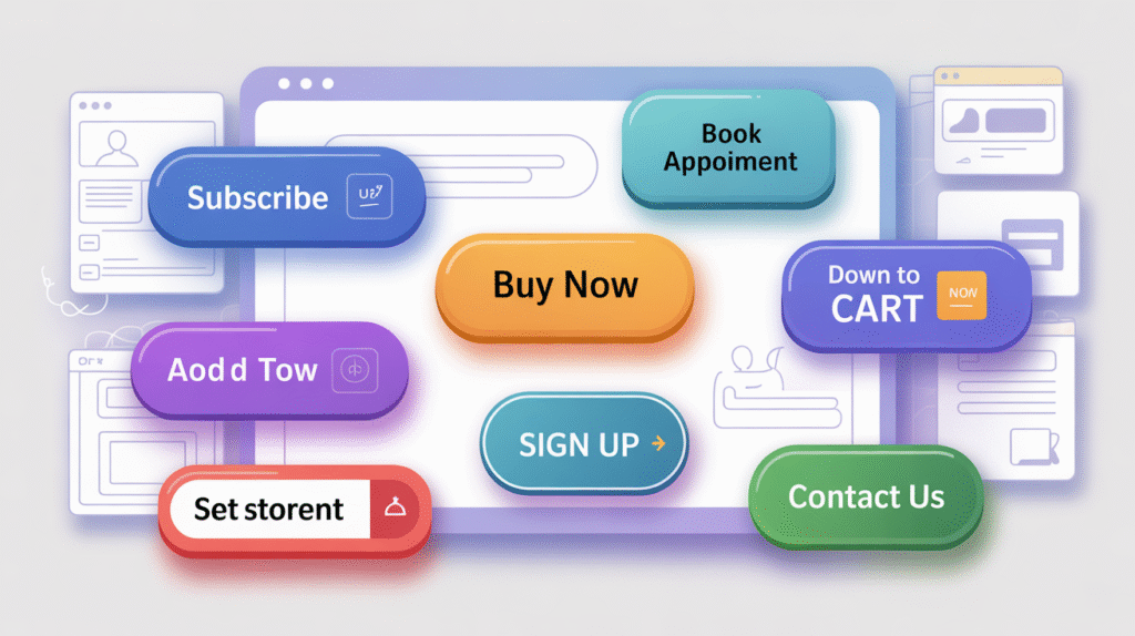
A call to action is a persuasive element that sits strategically in digital assets to prompt your audience toward specific actions. These prompts guide users through set paths to conversion. CTAs show up as buttons, text links, and images that engage attention and spark quick responses. CTAs do much more than decorate your website. They create a direct channel to inspire user action, whatever that means—signing up for newsletters, downloading resources, or making purchases. Think of CTAs as digital signposts that show visitors their next steps clearly.
CTAs serve several key functions in marketing strategy:
- Revenue generation: Users might never become customers without a strong push to convert
- Data collection: You can gather valuable information from users not ready to buy
- User direction: Clear paths emerge through your digital assets
- Engagement improvement: Brand interaction deepens even with top-of-funnel CTAs
CTAs tap into decision-making psychology. Simple phrases like “Buy Now,” “Sign Up,” or “Learn More” create urgency and point users to clear actions. This psychological element makes CTAs powerful tools that shape user behaviour.
How CTAs impact conversion rate optimisation
CTAs and conversion rates share a strong connection. Studies show that smart placement and thoughtful design of CTAs lead to big jumps in sign-ups, purchases, and other desired actions. Research proves that better CTAs can transform user engagement and conversion metrics.
Companies that use strong CTAs see better numbers across the board—more sales, stronger leads, and higher user interaction. The numbers tell the story while the average conversion rate of a website is 2.4%, great CTAs can push that to 11.5% or higher. Where you put your CTA matters a lot. CTAs above the fold work 304% better than those below. Using just one CTA instead of many can boost conversion rates by 266%, which shows how the number of CTAs affects user choices.
Product pages with CTAs at the bottom can see 70% more conversions. Users pay more attention to buttons in this spot and feel more ready to take action. Psychology explains why CTAs work so well. Perceptual set theory suggests that visitors expect to see a call to action on your landing page. Past experiences with similar pages create this mindset. Visitors actively look for and respond to CTAs, making them key to your conversion strategy.
CTAs might look basic, but they combine psychology, design, and strategic marketing in clever ways. With 90% of headline readers also checking out your CTA, these elements play a huge role in conversion optimisation.
Understanding user intent before creating CTAs
CTA optimisation starts well before you pick button text or colours. Successful conversion rate optimisation depends on understanding why people visit your website.
Types of user intent: informational, navigational, transactional
User intent (sometimes called search intent) shows the main goal behind a person’s search query or website visit. Most visitors fall into four distinct categories:
- Informational Intent: These visitors want knowledge or answers to specific questions. They search for phrases like “how to fix a leaky faucet” or “what is blockchain”. Users at this stage gather information at the top of your marketing funnel. They rarely make immediate purchases but form their first impressions of your brand.
- Navigational Intent: These visitors look for a specific website or webpage. Their queries include brand names or specific page references like “Facebook login” or “Canon support”. These users know their destination and need help getting there.
- Commercial Intent: This describes visitors who research products or services before buying. Their searches might include terms like “best laptops under $1000” or “iPhone vs Samsung comparison”. Commercial intent shows users are in the consideration phase and review their options.
- Transactional Intent: These visitors are ready to act, whether buying, signing up for a service, or completing a specific task. Their queries often contain action words like “buy,” “purchase,” “download,” or “subscribe”. Transactional intent shows users at the bottom of your funnel who are prepared to convert.
Understanding these intents is vital. A mismatch between user intent and your CTA messaging frustrates potential customers and wastes marketing resources. Showing a “Buy Now” button to someone still researching creates friction instead of facilitating conversions.
Arranging CTA with user journey stage
After identifying user intent, match your CTA to each stage of the customer’s experience:
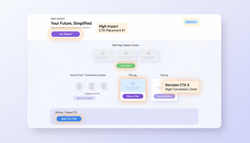
- For Awareness Stage (Informational Intent): Visitors just start to recognise their needs or problems at this early stage. Your CTAs should educate rather than push for immediate conversion. Effective CTAs include “Learn More,” “Get the Guide,” or “Subscribe for Updates”. These low-commitment options build trust without pressuring visitors who aren’t ready to buy.
- For Consideration Stage (Commercial Intent): Users actively compare solutions during this phase. Your CTAs should help them review options through phrases like “Compare Plans,” “Watch Demo,” or “See Case Studies”. These CTAs show users you support their decision-making process.
- For Decision Stage (Transactional Intent): Users ready to take action need direct, conversion-focused CTAs: “Buy Now,” “Start Your Free Trial,” or “Sign Up Today”. These CTAs create clear paths for users who have finished their research.
Beyond appropriate messaging, optimal CTA placement changes by intent. Informational content works well with inline CTAs, while transactional pages need prominent, above-the-fold buttons. Each user arrives with different levels of awareness to optimise CTAs for conversion. The five stages unaware, problem-aware, solution-aware, product-aware, and most aware need tailored CTA approaches.
The customer’s experience isn’t always linear. Users move between stages or approach your site from different starting points. Intent-driven CTAs throughout your website ensure you meet visitors wherever they are in their decision-making process. Understanding user intent and arranging your CTAs creates smoother paths to conversion that respect visitors’ needs rather than forcing early actions—this is what makes conversion optimisation services work.
How to write high-converting CTA copy
The words you choose for your CTA buttons can significantly affect conversion rates. A study showed that changing just one word in CTA copy increased click-through rates by 90%. Here’s what makes CTA copy work for your conversion rate optimisation efforts.
Use of action verbs and benefit-driven language
Strong CTA copy starts with a power verb that moves visitors to take immediate action. These verbs create momentum and make your buttons more vibrant and engaging. Your conversion rates could rise by up to 12.7%. You should pick verbs that match your specific conversion goals:
- Ecommerce: Buy, Shop, Order, Reserve, Save, Add to Cart
- SaaS platforms: Try, Get Started, Subscribe, Sign Up
- Non-profit: Donate, Commit, Volunteer, Adopt, Give
- Community building: Join, Subscribe, Refer
- Content distribution: Download, Grab, Claim, Take
Action verbs alone won’t do the job. Effective CTAs must also show value, not just effort. You should move from “calls to action” to “calls to value”. To cite an instance, “Submit” focuses on what users must do, while “Get Your Free Guide” shows what they’ll receive. Research shows that first-person phrasing performs better than second-person or neutral phrasing. A test showed that changing “Start your free 30-day trial” to “Start my free 30-day trial” boosted click-through rates by 90%. This simple pronoun change creates ownership before users click.

Avoiding vague phrases like ‘Click Here’
Generic phrases like “Click Here,” “Submit,” or “Learn More” waste conversion opportunities. These basic CTAs leave visitors guessing about what happens after they click. Such ambiguity creates hesitation the biggest enemy of conversion. Unclear CTA language puzzles potential leads and hides benefits. Users rarely take action when they don’t understand what they’re doing. A specific CTA like “Download our free ebook now” works better than “Click Here” because it shows both the action and the value.
Some words create psychological barriers. Terms like “buy,” “submit,” and “order” highlight the effort needed rather than the benefit received. Softer alternatives work better “Explore our new summer shirts” converts better than “Buy our new summer shirts” by reducing perceived commitment while staying clear. The best CTA copy uses 3-4 words. This keeps your message quick to process without losing clarity. Your decision process should be effortless for users, removing conversion barriers.
Examples of strong CTA button text
These high-converting examples show these principles at work:
- For free content:“Yes, Send Me the Free eBook!””Download My Free Checklist””Get Your Free Sample”
- For trials and demos:“Start My Free Trial””Try It Free For 7 Days””Show Me How It Works”
- For purchases:“Shop Now and Enjoy 20% Off””Grab Your Deal””Add to Cart”
- For subscriptions:“Join Our Loyalty Programme””Subscribe for Updates””Save My Spot”
The best CTAs share common features: strong verbs, clear value, brevity, and personalization. Button-based CTAs have shown to improve conversion rates by approximately 28%, making them crucial to your CTA optimisation strategy. You should test different versions of your CTA copy. No business gets their CTAs right the first time. A/B testing helps you find which versions strike a chord with your audience and drive the highest conversion rates.
Designing CTA buttons that get clicked
Your CTA buttons’ visual design is a vital part of making them work. The way buttons look and where you put them can make a huge difference in click-through rates. A simple change in button colour can boost conversions by 21%. Let’s look at what makes CTAs impossible to resist.
Colour contrast and size considerations
Colour contrast forms the foundation of effective CTA optimisation. Your button needs to pop against its background—this visual difference matters more than the actual colour choice. Tests show that high-contrast buttons get more attention and clicks. Here’s what to do with colours:
- Pick buttons that really stand out from your page background
- Make sure button text contrasts with the button colour (at least 3:1 ratio to meet WCAG rules)
- Use complementary colours (opposite on the colour wheel) to create the biggest effect
Button size needs to be noticeable yet fit your overall design. Apple and WCAG say buttons should be at least 44px by 44px, while Google wants them at 48px by 48px. On top of that, tiny buttons frustrate mobile users and lead to missed or wrong taps.
Placement above the fold vs. inline
Where you put your CTA buttons can make or break your conversion rates. People used to think CTAs had to be “above the fold” (visible without scrolling). In spite of that, this isn’t always the best way. People scan content in predictable ways. On content-heavy pages like blogs, they usually follow an F-pattern—scanning the top, then down the left side. Pages with less content typically create a Z-pattern scanning behaviour.
Here are smart ways to place your CTAs:
- Above the fold for instant visibility
- Within content for context after sharing key information
- At natural endpoints where users feel ready to act
Complex offers often work better with below-the-fold CTAs because visitors want to understand what they’re getting into first.
Whitespace and visual hierarchy
The empty space around your CTA buttons (whitespace) makes them more visible and effective. Don’t think whitespace does nothing—it’s actually a powerful design tool that draws eyes to conversion elements.
Good whitespace use:
- Makes CTAs pop by giving them breathing room
- Puts emphasis on what matters
- Creates a cleaner user experience
- Sets up clear visual hierarchy
Buttons with enough whitespace become impossible to miss, unlike cluttered designs. This isolation helps users spot and click buttons easily on any device. Visual hierarchy plays a big role in conversion rate optimisation. The way you arrange elements by importance guides visitors toward your main CTAs. You can create this hierarchy through:
- Different sizes (bigger things grab more attention)
- Eye-catching colours for key elements
- Smart spacing between elements
- Matching styles for similar actions
To get the best results from your conversion optimisation efforts, test different design versions. A/B testing, heatmaps and analytics will show which button designs click with your audience.
Psychological triggers that boost CTA performance
Your CTA’s success depends on more than just design and copy. The psychology behind them plays a crucial role in converting visitors into customers. These psychological triggers can substantially boost your conversion rates through strategic CTA optimisation.
Creating urgency and scarcity
Our brains naturally value things that are limited or disappearing fast. This lack of availability makes us place higher value on rare items and lower value on abundant ones. Fear drives this behaviour specifically, the fear of missing out (FOMO). Research shows at least 56% of people actively experience FOMO.
You can copy, apply, and extend scarcity and urgency in your CTAs through several proven methods:
- Limited-time offers: Short-duration sales naturally create urgency. Countdown timers show time constraints and boost conversions.
- Limited quantity: Messages like “Only X items left” spark immediate desire. Booking.com uses this well with alerts like “Only two rooms left at this price”.
- Urgent language: Words like “Act now,” “Offer ends soon,” or “Last chance” tap into time sensitivity.
Keep your urgency tactics authentic. Studies reveal that scarcity tactics fail when people see them as manipulative. Products can lose value if they appear scarce first and become abundant later.
Using social proof near CTAs
Social proof makes people look at others’ actions and opinions to guide their choices, especially during uncertainty. This approach works wonders 82% of users ask friends and family before buying, while 88% trust user reviews as much as personal recommendations. Placing social proof near your CTAs creates a natural link between the button and your site’s credibility. Uncertain visitors feel more confident when they see testimonials or familiar logos near CTAs. Sales pages with testimonials or proof convert 34% better than those without.
Effective social proof elements near CTAs include:
- Customer testimonials and reviews
- Trust badges and security symbols
- User statistics (“Join 10,000+ happy customers”)
- Brand logos of notable clients
- Expert endorsements
Retargeted ads with social proof can improve response rates up to 400% compared to cold ads. Sales-based social proof notifications can increase conversions by 98%.
Reducing friction and anxiety
Anxious visitors won’t click your CTA. Friction in the conversion process hurts conversion rates by blocking the user experience. Each extra barrier makes users more likely to leave.
These strategies reduce friction and anxiety around your CTAs:
- Use low-commitment language: “Buy” creates psychological friction. Softer words like “explore” reduce perceived commitment.
- Add trust signals: Security badges show data protection. Recognised trust badges ease safety and privacy concerns.
- Simplify the choice: Fewer options work better. Multiple CTAs on one screen reduce conversions. A single focused ask helps users decide fast.
- Provide clear next steps: Your CTA should show exactly what happens next to remove uncertainty.
People always choose the easiest path to get results. A simple framework for your audience streamlines CTA optimisation and boosts conversion rates. These psychological triggers help your CTAs do more than exist on the page they actively convince visitors to take action.
Where to place CTAs for maximum impact
The right spot for your CTAs can turn visitors into customers. You need to understand how users behave and what fits your page context to find the best position for these significant elements.
Above the fold vs. end of content
The big question in CTA optimisation boils down to button placement – should they go above or below the fold? Research tracking eye movements reveals content above the fold (what you see without scrolling) gets 102% more attention than what’s below. This makes above-the-fold spots great for simple offers or free products where users know what they’re getting.
But this doesn’t work everywhere. Complex products like software or expensive items see 20% more conversions with below-the-fold placement. Users need enough information before they take action. Putting CTAs after explanatory content helps visitors click with more confidence. The sweet spot isn’t just about position. One expert puts it well: “your goal is to predict the point where your prospect will be ready to take the next step, and put your CTA there“.
In-content CTAs for blog posts
Blog posts are a great way to get strategic with CTA placement. Capture forms at the top work well for quick visibility, while CTAs at the end take advantage of engaged readers. People who read to the end are more likely to convert.
Blog posts work best with these placements:
- Sidebar CTAs that stay visible
- In-text CTAs matching the topic
- End-of-article CTAs before comments
- Slide-in CTAs appearing at specific scroll points
Analytics show that natural product mentions within blog content perform well, especially when the solution matches the topic. CTAs between blog sections help readers explore more content, which keeps them on your site longer and boosts conversion chances.
Sticky CTAs and exit-intent popups
Sticky CTAs follow users as they scroll, keeping conversion opportunities visible. Mobile devices love these floating buttons – one test showed 25% more sales and 22% higher revenue per visitor. Exit-intent popups catch visitors just before they leave your site. These last-chance tools typically convert an extra 2-4% of website visitors. The best exit campaigns can even convert up to 19.63% of visitors.
Exit-intent popups work best when you:
- Show compelling offers related to page content
- Write clear, benefit-focused headlines
- Keep form fields minimal (just one is ideal)
- Add urgency or scarcity when it fits
Note that placement should enhance user experience first. Even perfectly positioned CTAs fail when they disrupt content flow or feel pushy.
Testing and improving your CTAs
Your CTAs need constant refinement through evidence-based testing. The best results come from regular assessment and optimisation of CTAs to maximise conversion potential.
How to do A/B testing for CTAs
A/B testing lets you try different CTA versions to find what works best with your audience. The best way to optimise CTAs involves testing one element at a time:
- Button size and colour
- CTA text and placement
- Page designs around the CTA
Results become more accurate when you avoid testing multiple elements at once. This approach helps identify which changes affect performance. Small animations or colour changes can boost engagement substantially. You could try an animated version that changes colour or gives a small shake after a few seconds.
Using heatmaps and scrollmaps
Heatmaps turn raw user data into user-friendly, colour-coded visualisations that reveal where visitors click, scroll, and focus their attention. This visual feedback shows whether your CTAs get enough attention or go unnoticed. Scroll maps show how far users move down your page and which content sections get the most visibility. This knowledge helps place CTAs in optimal positions, especially on long pages where users might miss buttons at the bottom. The hotspots (areas with highest colour intensity) reveal which elements catch attention and which ones users ignore. You can then move CTAs to areas where users engage more.
Tracking CTA performance in Google Analytics
Event tracking setup in Google Analytics measures CTA interactions effectively. The event tracking code snippet (_trackEvent) helps define key tracking elements like category, action, and label.
Goals provide deeper insights by tracking:
- Referral sources completing conversions
- Goal funnels visualising where visitors drop off
- Conversion metrics specific to each CTA
This complete testing approach turns your conversion optimisation into a continuous improvement cycle.
Common CTA mistakes to avoid
Your well-designed and strategically placed CTAs might still fail due to these common traps. The things you avoid can be just as crucial as the ones you implement while optimising your CTAs.
Too many CTAs on one page
Multiple competing calls-to-action on a single page create decision paralysis. Users who face too many choices often end up making none at all. Research shows pages loaded with CTAs result in fewer conversions. This choice overload leaves users stuck and unable to make decisions. The best results come from using one main CTA per page, while clearly marking secondary options as distinct.
Unclear or misleading CTA text
Basic button text like “Click Here” or “Submit” doesn’t tell visitors what comes next. Such unclear wording makes busy users decode your intentions instead of taking quick action. Your CTA text should explain itself by clearly stating what will happen. The best approach is to swap generic phrases with specific, action-focused words that show clear benefits.
Ignoring mobile optimisation
Mobile traffic rules the web now, and non-responsive CTAs can hurt your conversion rates badly. Mobile CTAs need specific features:
- Buttons must be finger-tap friendly (minimum 44-48px)
- Smart placement that works with limited screen space
- Colours that stand out clearly on small screens
- Easy-to-read text without needing to zoom
CTAs that are tiny, crowded, or hard to tap create a frustrating experience for mobile users.
Conclusion
Well-optimised CTAs work as conversion tools. This piece shows how smart CTA development affects your conversion rates and business growth. The foundation of any successful CTA strategy lies in understanding what users want. People at different stages of their buying trip need different approaches – from educational CTAs that build awareness to direct conversion buttons that drive decisions.
Your CTA copy should mix action verbs with clear statements about benefits. Words like “Get,” “Find,” and “Start” combined with clear value statements work better than vague phrases like “Click Here” or “Submit” by a lot. On top of that, smart design choices about colour contrast, size, and whitespace can boost visibility and click-through rates.
Without doubt, psychological triggers make CTAs perform better when used naturally. The lack of products, urgency, social proof, and less friction work together to drive more conversions. Smart placement – whether above the fold, within content, or as sticky elements – should line up with how users behave rather than follow strict rules.
Making CTAs better needs constant testing and fine-tuning. A/B testing, heatmap analysis, and tracking help find ways to improve. You should also avoid common mistakes like too many CTAs on one page, unclear language, or poor mobile design to keep your conversion elements working well.
Think about CTA optimisation as an ongoing process, not a one-time job. Small improvements add up over time and lead to better conversion rates without needing more traffic. You can start using these strategies today, test them really well, and watch your conversion rates grow as your CTAs change from simple buttons into conversion powerhouses.
Key Takeaways
Optimising CTAs is one of the most cost-effective ways to boost conversions without increasing traffic, with well-crafted buttons potentially improving conversion rates from 2.35% to over 10%.
- Match CTA messaging to user intent educational CTAs for awareness stage, comparison-focused for consideration, and direct action for decision-ready visitors.
- Use specific action verbs with clear benefits rather than vague phrases like “Click Here”changing copy can increase clicks by up to 90%
- Design buttons with high colour contrast, adequate size (44-48px minimum), and strategic whitespace to ensure visibility and mobile usability.
- Apply psychological triggers like urgency, scarcity, and social proof authentically to overcome hesitation and drive action.
- Test continuously using A/B testing and heatmaps avoid multiple CTAs per page as this creates decision paralysis and reduces conversions by up to 266%
Remember that effective CTA optimisation is an ongoing process of testing, measuring, and refining based on user behaviour data rather than assumptions.
FAQs
Q1. What are some effective strategies for optimising CTAs? To optimise CTAs, use concise and action-oriented text, ensure clear messaging with a compelling value proposition, and align the CTA with the landing page content. Implement strategic colour psychology, A/B test different variations, and ensure the CTA is prominently placed and easily clickable on all devices.
Q2. How can I create a stronger call-to-action? To create a stronger CTA, start with a powerful action verb, incorporate emotionally engaging words, provide a clear reason for users to act, and leverage FOMO (fear of missing out). Tailor your CTA to the device type, conduct A/B testing, include specific numbers when relevant, and don’t be afraid to use bold, attention-grabbing language.
Q3. What are some best practises for improving conversion rate optimisation? To enhance conversion rate optimisation, focus on user experience (UX) design, implement clear and compelling CTAs, and utilise A/B testing to refine your website. Additionally, leverage behavioural analytics for deeper insights into user behaviour and optimise page load speeds to reduce bounce rates and improve overall user satisfaction.
Q4. What is considered a good conversion rate for CTAs? While conversion rates can vary by industry and context, email CTAs are capable of achieving conversion rates of up to 15%. This high performance makes them a vital tool for generating results. However, it’s important to continually test and optimise your CTAs to achieve the best possible conversion rate for your specific audience and offerings.
Q5. How does user intent impact CTA effectiveness? Understanding user intent is crucial for CTA effectiveness. Match your CTA messaging to the user’s stage in the customer journey: use educational CTAs for the awareness stage, comparison-focused CTAs for the consideration stage, and direct action CTAs for decision-ready visitors. Aligning your CTA with user intent can significantly improve click-through rates and overall conversions.