
Mobile devices generate just under 55% of all global traffic. Your website’s success depends on a technical SEO audit checklist that puts mobile optimization first. Google wrapped up their mobile-first indexing rollout in 2023. They now use your site’s mobile version to rank and index content.
But many websites can’t get mobile optimization right. Page experience has become crucial for rankings. Core Web Vitals metrics like CLS, INP, and LCP directly shape your search visibility. Google gives priority to sites that keep users involved, whatever device they’re using. Users will leave your site quickly if they find it poorly designed, hard to use, or messy. They’ll look for something more trustworthy instead. A full technical SEO audit can spot critical problems that hurt your mobile performance.
This technical SEO checklist offers proven fixes to optimize your site for mobile-first indexing. You’ll discover ways to audit your mobile SEO, speed up pages, solve crawling issues, and add structured data the right way. Doing this creates a smoother experience for mobile users and boosts your chances of climbing higher in search results.

Audit Mobile-First Indexing with Google Search Console
Google uses mobile-first indexing for over half of the pages in search results worldwide. The search engine crawls and indexes your website’s mobile version first. A good technical SEO audit starts by checking how your site handles mobile-first indexing standards.
Check Mobile Usability Report for Errors
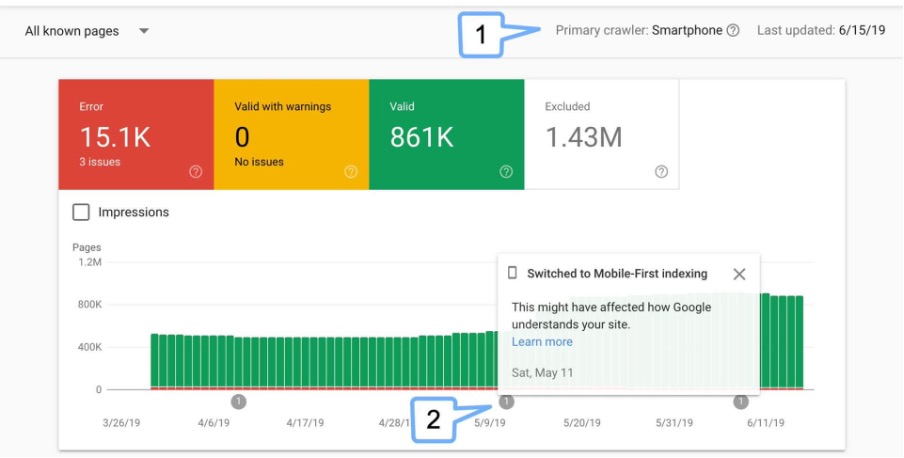
Your technical SEO audit checklist should begin with the Mobile Usability report in Google Search Console. You’ll find it under “Experience” > “Mobile Usability”. This shows if your site has any critical mobile issues. The report labels pages as either “Valid” or shows specific errors.
Watch out for these common mobile usability errors:
- Viewport not set or not configured properly
- Text too small to read
- Clickable elements too close together
- Content wider than screen
- Uses incompatible plugins
These errors change how users interact with your site. Users might tap the wrong element when clickable items sit too close together. Small text forces people to zoom in, which creates a bad experience. You can see affected URLs by clicking each error type. Fix these issues quickly – Google might lower your mobile search rankings if your site isn’t user-friendly.
Compare Mobile vs Desktop Content Parity
Your mobile site needs the same main content as your desktop version with mobile-first indexing. Google could miss key information if it’s not there. Here’s how to compare mobile and desktop performance in Search Console:
- Open the Performance report
- Click “New” to add a filter
- Choose “Device”
- Select “Compare: Mobile vs Desktop”
This shows differences in clicks, impressions, CTR, and average position between devices. Look closely at pages that do well on desktop but not on mobile – they need work. Make sure your structured data matches on both versions. Many websites have structured data on desktop pages but forget about mobile. You’ll miss out on rich results if your mobile version lacks structured data since Google looks there first. Check if your headings make sense on both versions. Content parity means more than matching text – the meaning and structure should be the same everywhere.
Use URL Inspection Tool for Rendered HTML
Google’s URL Inspection tool shows exactly how Googlebot sees your mobile pages. This helps find rendering issues that could hurt indexing.
Follow these steps to use the tool:
- Open URL Inspection in Search Console
- Enter the complete URL you want to analyze
- Check the “Mobile Usability” section
- Click “Test Live URL” for live analysis
- Select “View Tested Page” to see the rendered version
The tool tells you if your page works on mobile or not. It also shows if Google can access and render all resources, including CSS and JavaScript files your mobile display needs. The URL Inspection tool lets you see HTML code just as Googlebot does. This helps find JavaScript rendering issues that often show up differently on mobile than desktop.
Look at the “Enhancements” section of inspection results to verify structured data. This reveals if Google found your schema markup on mobile. Bad or missing structured data on mobile can really hurt your rich results chances. Check your key pages with this tool often, especially after big site changes. Mobile rendering issues can pop up without warning, even on sites that passed previous tests.
These Google Search Console tools help build strong foundations for your technical SEO audit. Good checks ensure Google crawls, renders, and indexes your mobile content right – you need this for better mobile rankings.
Optimize Mobile Page Speed Using Core Web Vitals
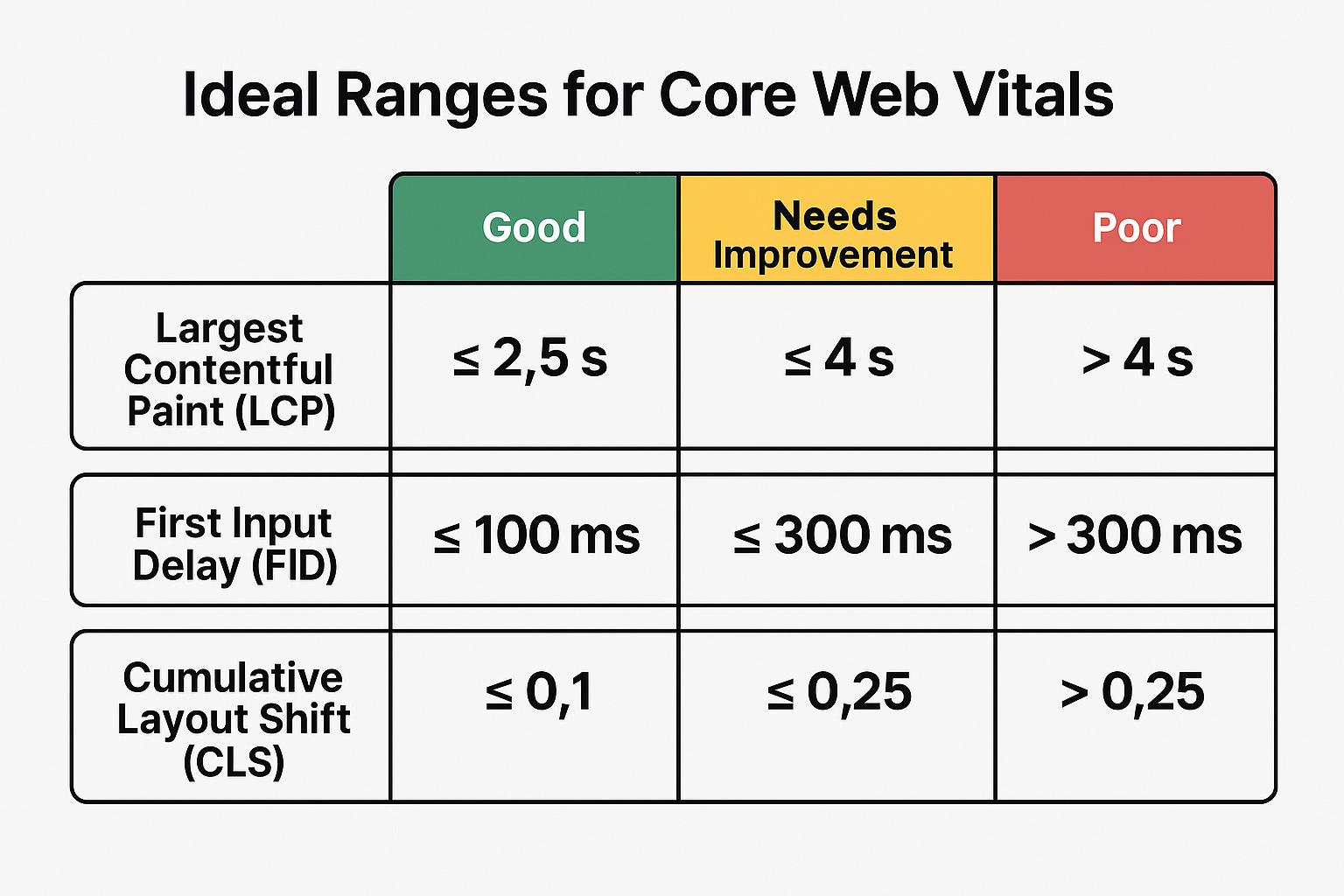
Google’s ranking algorithm now places substantial weight on Core Web Vitals for mobile performance. Your technical SEO audit needs these metrics. Missing them means you’ll leave valuable ranking potential unexplored. Mobile speed optimization revolves around three metrics: Largest Contentful Paint (LCP), Interaction to Next Paint (INP), and Cumulative Layout Shift (CLS).
Improve LCP with Lazy Loading and Compression
The main content’s loading speed is measured by Largest Contentful Paint. Your LCP should happen within the first 2.5 seconds of page load. User engagement drops with poor LCP scores—a single second delay in mobile load time can cut conversions by up to 20%.
Here’s how to optimize LCP for mobile devices:
- Prioritize above-the-fold content – Users need quick access to key information, so load vital content first, even if other elements take longer.
- Compress images properly – Images often determine LCP. Modern formats like WebP offer 25% smaller file sizes than PNG or JPG at the same quality level.
- Implement lazy loading selectively – Lazy loading works great for below-fold images, but don’t use it for your LCP image. This makes browsers run JavaScript before loading vital content. Add fetchpriority=”high” to your main image instead.
- Reduce render-blocking resources – Cut down unnecessary CSS or JavaScript files that slow down your largest element. Speed up initial rendering by inlining critical CSS in your HTML.
Reduce INP by Deferring Non-Critical JS
INP has replaced First Input Delay as a Core Web Vital metric. It shows how fast your site responds to users. The best user experience needs an INP under 200 milliseconds. A detailed technical SEO audit checklist should include these INP improvements:
- Break up long tasks – Large JavaScript operations can block the main thread. Make them smaller to keep your page responsive.
- Defer non-essential scripts – Use the defer attribute for scripts you don’t need right away. Browsers can focus on painting the page first.
- Yield to the main thread – Keep event callbacks light. Your page stays responsive even during complex tasks.
- Remove unused JavaScript – Get rid of unnecessary JavaScript. Old resources from previous versions might still slow down your site.
Well-optimized mobile design makes resource loading efficient and improves responsiveness during idle times.
Fix CLS with Fixed Dimensions for Media
Visual stability is measured by Cumulative Layout Shift. Users need a CLS score below 0.1 for good experience. Mobile users hate content jumps – they might tap wrong elements accidentally. Your technical SEO audit should focus on these CLS fixes:
1. Always specify image dimensions – Every <img> tag needs width and height attributes. Browsers can then save the right space before loading:
<img src=”example.jpg” alt=”Description” width=”640″ height=”360″>
2. Use CSS aspect ratio – Mix HTML dimensions with CSS for responsive images:
img { max-width: 100%; height: auto; }
3. Reserve space for dynamic content – Save space for ads, embeds, or iframes using CSS properties like min-height or aspect-ratio:
.ad-container { aspect-ratio: 16 / 9; }
4. Optimize web font loading – Prevent text shifts when fonts load by using font-display: swap.
A full technical site audit with these Core Web Vitals optimizations will boost your mobile performance substantially. Your users will have a better experience, and you might see better search rankings. Google has confirmed that sites need to meet all three Core Web Vitals to get the available ranking boost.
Fix Crawlability and Indexing for Mobile Pages
Mobile SEO success depends on crawlability and indexing. Google can’t index your content if it can’t access your mobile pages – no matter how well you optimize it. Your technical SEO audit checklist needs to address these access points to make your mobile-friendly site show up in search results.
Make Sure Mobile Pages Aren’t Blocked in robots.txt
Mobile-first indexing needs matching robots directives for both mobile and desktop versions. Your technical site audit should check if your robots.txt file doesn’t accidentally block Googlebot-smartphone from reaching important content. Developers often create separate directives for mobile sites without realizing what this means for indexing.
Here’s how to check your robots.txt setup:
- Access your robots.txt file directly (example.com/robots.txt)
- Check for any rules specifically targeting mobile user-agents
- Make sure Googlebot and Googlebot-smartphone have matching access permissions
- Use Google Search Console’s URL Inspection tool to test accessibility
Robots.txt does more than control crawl traffic – it decides which pages Google can find and index. Using different robots meta tags on mobile and desktop sites (especially noindex or nofollow) might stop Google from crawling and indexing your mobile pages.
Set Up Canonical and Alternate Tags Right
Canonical and alternate tags guide Google to the right version of your content. These tags stay vital even with mobile-first indexing changing how Google looks at your site.
Sites with separate mobile URLs need this relationship:
- Mobile pages: Add <link rel=”canonical” href=”https://example.com/”> pointing to the desktop version
- Desktop pages: Add <link rel=”canonical” href=”https://example.com/”> pointing to itself plus <link rel=”alternate” media=”only screen and (max-width: 640px)” href=”https://m.example.com/”> pointing to the mobile version
This setup tells Google that the desktop version is the main one, but a mobile option exists. Search engines might index both versions on their own without these tags, which could split your ranking signals across duplicate pages. Setting up these tags correctly matters even more after switching to mobile-first indexing. The desktop URL usually stays as the canonical, while the mobile version works as the alternate.
Add Mobile Sitemaps in GSC
Creating and adding dedicated mobile sitemaps in Google Search Console helps Google find and crawl your mobile URLs faster. Your mobile sitemaps should:
- Have separate sitemaps for different markup languages if your site uses multiple mobile formats
- List URLs that use multiple markup languages in each relevant sitemap
- Stay under 50,000 URLs and 50MB
- Include your sitemap in robots.txt for better discovery
Submit your mobile sitemap through Google Search Console’s Sitemaps report. This helps Google crawl your mobile content better, especially for bigger sites with complex structures. You should verify both site versions in Search Console to track data and messages for each. This helps you spot crawling or indexing issues before they hurt your mobile search presence. Managing robots.txt, canonical/alternate tags, and mobile sitemaps properly lets your technical SEO audit ensure Google finds, crawls, and indexes your mobile content effectively – key steps to succeed with mobile-first indexing.
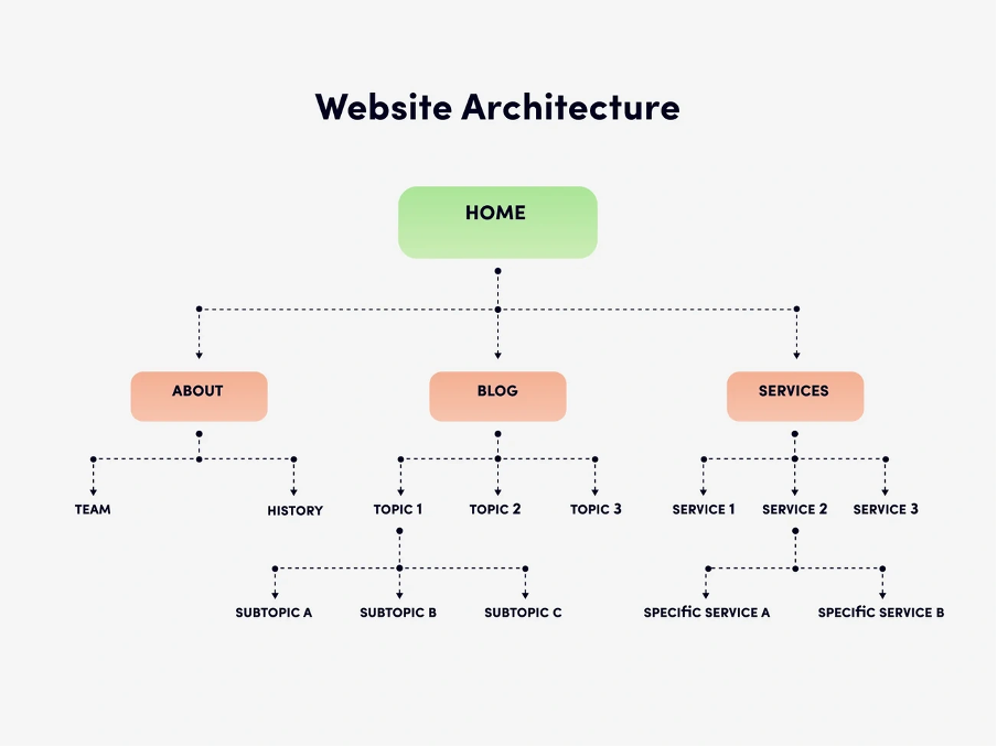
Improve Mobile Site Architecture and Internal Linking
A solid site architecture serves as the foundation for mobile SEO, yet many technical SEO audits overlook it. Your mobile site needs easy-to-follow pathways that search engines and users can understand. This directly affects your visibility and conversion rates.
Reduce Click Depth for Key Mobile Pages
The number of clicks from your homepage to reach any page defines click depth. Mobile users need this even more because they use smaller screens. Pages that need three clicks or fewer rank better in search results. Google prioritizes pages just a click away over those requiring multiple clicks.
Your website structure should let visitors access content in fewer than four clicks. Search engines will understand your site better, and users won’t get frustrated. Deep hierarchies make it hard for crawlers to find all your web pages, and they might miss valuable content.
Your click depth will improve if you:
- Create easy-to-use navigation menus that point to critical pages
- Add breadcrumb navigation to show location
- Build strategic internal links from pages with high authority
Add Internal Links to Orphaned Mobile Pages
Orphan pages create major issues in mobile technical site audits. No internal links point to these pages, leaving them isolated from your site structure. Search engines might remove them from the index, which means zero organic traffic. You’ll notice more organic traffic and better user experience after fixing orphan pages. Start by using tools like Screaming Frog, Yoast SEO Premium, or Link Whisper to find these pages. Then add relevant internal links to connect them back to your site. Mobile sites need special attention. Check if your navigation elements work on all devices. Some sites show section-specific sub navigation on desktop that vanishes on mobile. This creates orphan pages that only affect mobile users.
Use Descriptive Anchor Text for Mobile Users
Good anchor text helps users know what they’ll find when they tap a link. Mobile devices make this crucial because screen space is tight and users decide quickly. Don’t use generic phrases like “click here” or “read more”—they create accessibility problems and waste optimization chances. Your anchor text should use keywords that describe the destination content clearly.
Clear anchor text helps both search engines and visitors understand context and relevance. Search engines will associate the linked page with specific keywords better. Users will also stay longer because they know exactly what to expect from the linked content.
Implement Mobile-Friendly Structured Data
Structured data makes a vital difference between websites that simply show up in search results and those that grab attention with rich features. A full technical SEO audit checklist should include proper schema markup for mobile pages. This helps search engines better understand your content.
Add Schema for Articles, Products, and FAQs
Schema markup gives search engines standardized information about your content. The JSON-LD schema (Google’s preferred format) can turn regular search snippets into rich results. Your pages will look more attractive on mobile SERPs. These schemas will give you the best results:
- Article schema: Google will better understand your news, blog, or sports content. You don’t need it for Google News features like Top stories, but Article schema tells Google exactly what your content covers, including author details and when it was published.
- Product schema: E-commerce pages get better visibility as key information shows directly in search results. This leads to better click-through rates.
- FAQ schema: Pages with questions and answers need this schema. The complete text of questions and answers must be included. Websites using FAQ schema have seen 25% higher click-through rates compared to pages without it.
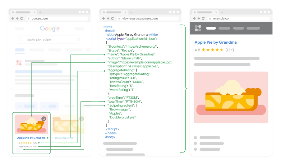
Image Source: Google for Developers
Avoid Marking Up Content Hidden on Mobile
Google now uses only mobile versions of pages for indexing. Your structured data should exist on both desktop and mobile versions. Missing mobile structured data means Google won’t see it at all.
Simple rules to follow:
- Users should see all marked-up content
- Don’t create empty pages just for structured data
- Your schema markup should match what’s visible on the page
Test Structured Data with Rich Results Tool
Google’s Rich Results Test helps verify your structured data before it goes live. This tool shows available rich result types and points out errors or suggestions. Here’s how to use it:
- Put in your URL or paste your code snippet
- Pick smartphone or desktop crawler
- Look at eligible rich results
- Address critical errors before going live
Your technical site audit should include regular structured data tests to meet Google’s requirements.
Fix Technical SEO Issues Affecting Mobile Performance
Mobile performance problems often stem from technical issues that casual users can’t see. A complete technical SEO audit checklist must tackle these fundamental elements to create the best mobile experience.
Remove Unused CSS and JavaScript
Code bloat leads to unnecessary data transfers and slower rendering—two critical problems for mobile users. Browsers must download, parse, and execute unused CSS and JavaScript code that doesn’t serve any purpose. Many websites load entire CSS frameworks but only use a small portion of the available components.
You can spot unused code by:
- Using Chrome DevTools Coverage panel to see used versus unused bytes in each resource
- Looking for CSS files with red sections that show unused code
- Checking PageSpeed Insights recommendations about “Reduce unused CSS/JavaScript”
Tools like PurgeCSS or UnCSS can help you automatically remove unused selectors once you find these issues. These tools look at your HTML and keep only the CSS your markup actually needs. WordPress users can try plugins like WP Rocket that offer features to keep only the CSS each page uses.
Image Source: LinkedIn
Fix Redirect Chains and Broken Links
Redirect chains create major performance issues on mobile devices. These chains happen when one URL redirects to another URL, which then redirects again. Each redirect adds extra HTTP requests and makes pages load slower. These chains also waste valuable “link juice” and might make Google stop crawling your site.
The solution is simple – point your original redirect straight to the final URL. This cuts out unnecessary steps and keeps your SEO value intact. You should also regularly check for broken links with tools like Screaming Frog or Google Search Console’s coverage report. Fix or remove these links to avoid frustrating dead ends for mobile users.
Ensure HTTPS and Secure Mobile Resources
Modern websites need HTTPS, especially for mobile users on public WiFi. Without it, anyone can intercept your plain text communications. Google Chrome labels all non-HTTPS sites as “Not Secure,” which immediately makes mobile visitors doubt your site’s trustworthiness.
Your SSL certificate should be valid and cover all resources to prevent mixed content warnings. The final step is to implement HTTP Strict Transport Security (HSTS). This ensures secure connections and improves mobile security.
Conclusion
Mobile-first indexing has altered how websites rank in search results. This technical SEO audit checklist shows the key factors that determine mobile success in today’s digital world. Google now reviews your site through its mobile version. These optimizations have become essential to rank well.
Your technical SEO strategy should put mobile usability first. This means working on everything from Core Web Vitals to structured data implementation. Better LCP, INP, and CLS metrics boost user experience and help you rank higher. The site needs proper crawlability through robots.txt setup, canonical tags, and mobile sitemaps that create strong foundations for indexing.
Site architecture matters just as much in mobile optimization. You can boost both user experience and search engine understanding by reducing click depth, removing orphan pages, and using clear anchor text. Good structured data helps your content shine in mobile search results with rich features. Technical problems like unused code, redirect chains, and insecure resources can hurt mobile performance even with good optimization. These mechanisms need constant attention rather than quick fixes.
Need expert help with your site’s SEO issues? Get a free mobile-first SEO consultation with our team at The ASK Network — let’s grow your rankings together!
Mobile optimization is an ongoing process. Search engines keep changing their algorithms and user needs change too. Regular technical audits with this checklist will keep you ahead of competitors and give mobile users the best experience. Without doubt, sites that focus on these mobile-first principles will get better visibility, more engagement, and end up with better organic search results.
FAQs
Q1. What are the key components of a technical SEO audit for mobile? A technical SEO audit for mobile should focus on mobile-first indexing, Core Web Vitals optimization, crawlability and indexing fixes, site architecture improvements, and implementation of mobile-friendly structured data.
Q2. How can I improve my website’s Core Web Vitals for better mobile performance? To improve Core Web Vitals, focus on optimizing Largest Contentful Paint (LCP) through lazy loading and compression, reducing Interaction to Next Paint (INP) by deferring non-critical JavaScript, and fixing Cumulative Layout Shift (CLS) by using fixed dimensions for media elements.
Q3. Why is proper implementation of structured data important for mobile SEO? Implementing structured data correctly helps search engines better understand your content and can lead to rich results in mobile search, potentially increasing click-through rates by up to 25%. Focus on schemas for articles, products, and FAQs for maximum impact.
Q4. How does site architecture affect mobile SEO performance? A well-structured mobile site improves both user experience and search engine crawling. Reduce click depth for key pages, add internal links to orphaned pages, and use descriptive anchor text to help users and search engines navigate your site more effectively.
Q5. What common technical issues can hinder mobile SEO performance? Common technical issues affecting mobile SEO include unused CSS and JavaScript, redirect chains, broken links, and insecure resources. Regularly audit and fix these issues to ensure optimal mobile performance and maintain search engine rankings.